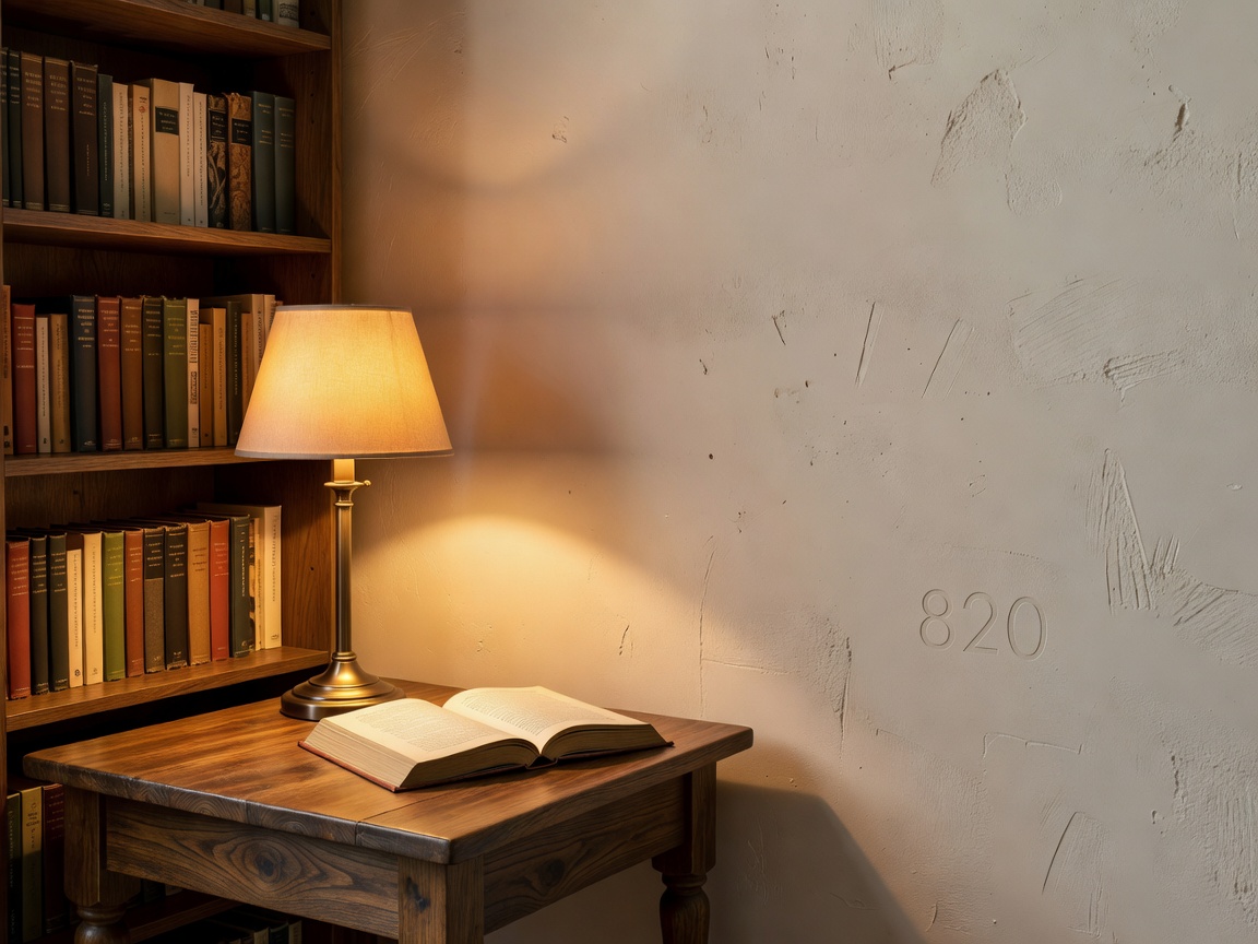
Review finishes in the room where they will be used. Daylight, artificial light and adjacent colors alter how surfaces appear. A small sample can show hue and grain, but a larger sample reveals repetition and reflection more accurately. Consider touch, cleaning, repair and how marks will show. Specify materials by their actual intended use and care requirements rather than by appearance alone.
Timber and veneer
Timber brings grain, tonal variation and a tactile surface. Its visual character depends on species, cut, finish, light and surrounding colors. Veneered surfaces can provide a consistent face across broad joinery; edges and seams need considered detailing. Solid timber and veneer differ in construction and behavior, so understand the finish, maintenance instructions and expected changes before selection.
Samples should be viewed vertically and horizontally where both occur in the room. Check how the grain sits beside book spines and whether the shelving becomes too visually active. A warm timber can balance mineral surfaces or darker paint. A more restrained grain can keep a large book wall quiet.
Painted cabinetry and metal
Painted cabinetry offers broad color choice and can connect shelves to walls, trim or doors. A close match can make built-ins feel continuous; a contrast can make the bookcase read as furniture. Finish sheen affects reflection and how surface marks appear. Ask about cleaning, touch-up and the preparation required for the selected surface. Sample the color in daylight and in evening conditions.
Metal can introduce a precise, contemporary edge through shelf supports, handles, frames or lamp components. Its color and sheen may reflect nearby light. Use metal as a detail where it clarifies construction or provides a useful contrast. Avoid relying on a decorative finish to conceal functional requirements such as access, cable routing or maintenance.
Glass, stone and plaster
Glass-fronted sections can protect selected books or objects while retaining a view. They also add reflections, fingerprints and cleaning. Consider whether reflections will compete with windows or a reading lamp. Open shelving is easier to access and avoids door clearance, but books remain exposed to dust. Choose by collection needs and maintenance habits.
Stone and plaster define the surrounding architecture. Their texture and tonal variation can provide a calm backdrop to shelves. Stone may be appropriate for a hearth or ledge; plaster can retain a soft, low-reflection quality depending on its finish. Coordinate cabinetry with changes in wall plane, skirting and window reveals. Do not assume a finish is suitable for a location without checking its care and installation requirements.
Layered lighting
Use ambient light for general orientation, task light for reading or writing and shelf light where it improves access or reveals the book wall. One central ceiling fitting rarely serves every position equally. Map lighting with the seating and desk plan. A reading lamp should illuminate the page without shining directly into the reader's eyes or creating an unwanted reflection.
Task lights can be positioned beside or behind a reader, depending on handedness, shade, room arrangement and glare. Test the intended seat before fixing a wall light. Shelf illumination should reveal titles without producing bright points in the visual field. Concealed sources need access for maintenance and a considered route for cables. Do not finalize lighting before deciding shelf construction and furniture position.
Glare, color temperature and daylight
Color temperature affects how timber, paper and paint are perceived. Select a consistent approach for related fixtures and consider how the room should read at different times of day. The best choice depends on user preference, other lighting, surface colors and lamp compatibility. Review the actual light source in context rather than choosing from a label alone.
Daylight changes through the day and by window orientation. Direct sun can create contrast and glare; reflected light may be softer. Position a reading chair and desk to avoid persistent glare on pages or screens. Curtains or blinds can help manage brightness, but should not obstruct ventilation or the operation of a window. Preserve a useful balance between daylight, shelf visibility and privacy.
Advantages and limitations
Timber: grain and warmth; finish and movement require informed care. Paint: flexible color and visual continuity; marks and touch-ups depend on the chosen finish. Metal: crisp detailing; reflective surfaces can introduce glare. Glass: display and protection; reflections and cleaning increase. Stone or plaster: architectural texture; suitability and maintenance vary by finish and location.
Good for
Timber suits rooms seeking visible grain and material warmth. Painted joinery suits a controlled color scheme. Metal details suit precise contemporary lines. Glass suits selected protected displays. Plaster and stone suit a room where surrounding surfaces should remain part of the composition.
What to know
Test samples in place. Confirm cleaning and maintenance needs. Layer ambient, task and shelf lighting. Check glare from the actual seat and desk. Consider color temperature as part of the material palette. Seek professional electrical or building advice where required. Related guides: European Library Styles, Bookshelves & Storage Systems and Reading Room Layouts.